Investor's Edge – UX Redesign
Redesigning CIBC's trading platform to make trading simpler, clearer, and more confident.
Context
Investor’s Edge is CIBC’s self-directed trading platform for retail investors. The challenge was to make trade workflows simpler and reduce friction for everyday users.
Role
UX Designer — Led end-to-end UX redesign, from research and wireframing to prototyping and usability testing.
Duration
6-week sprint. Collaborated with Product Manager and Engineering team to redesign flow, improve IA, and validate usability improvements.
Problem
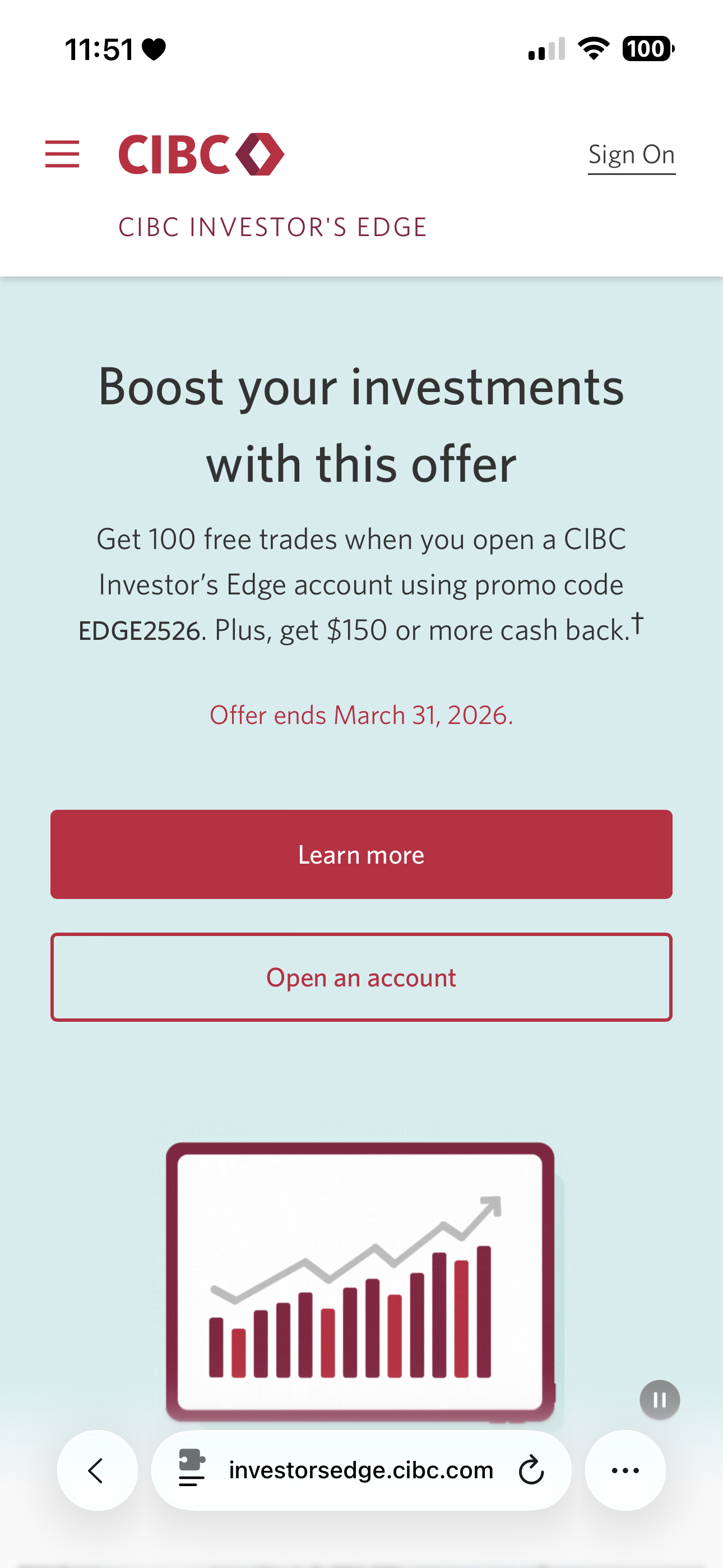
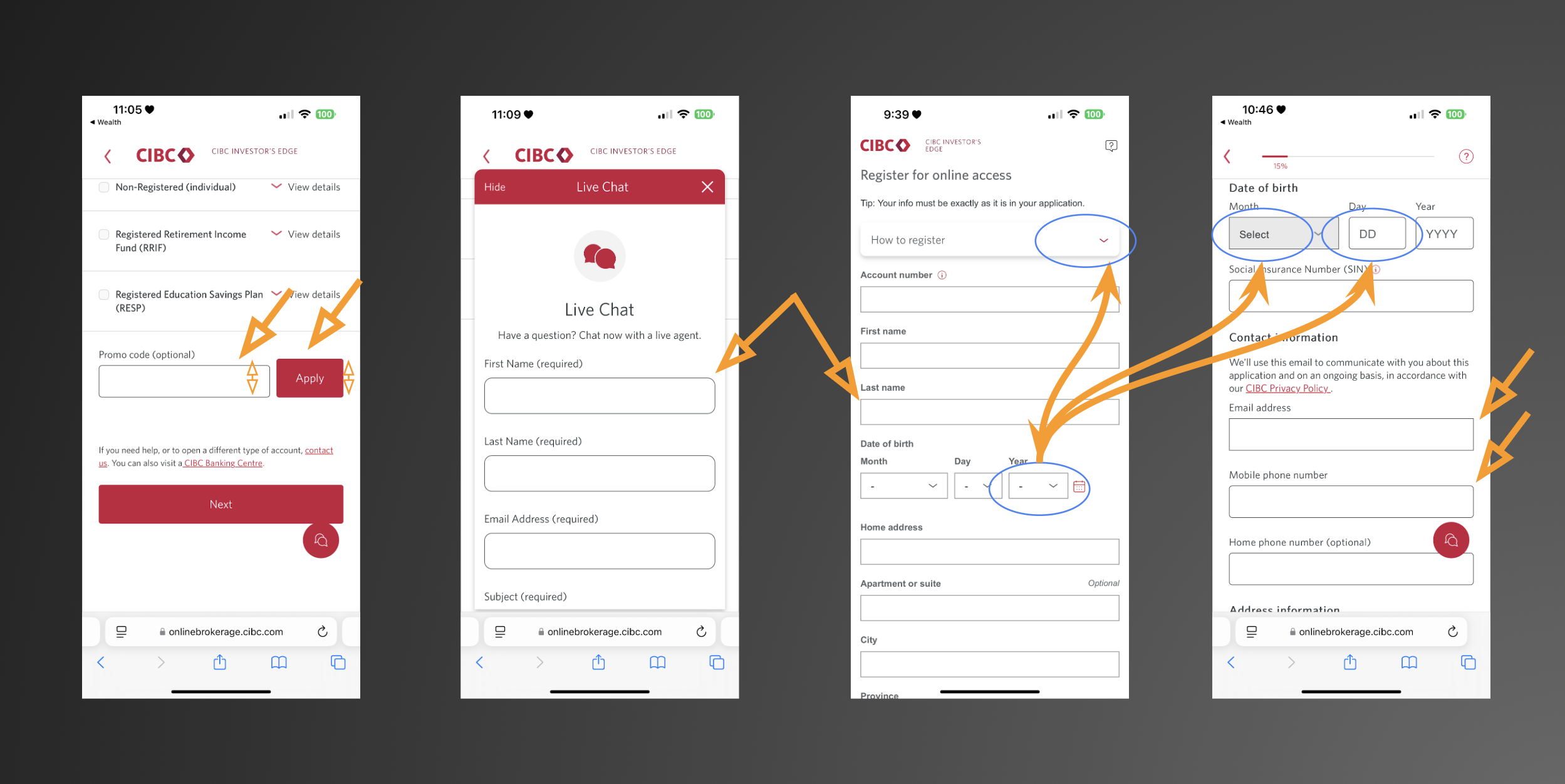
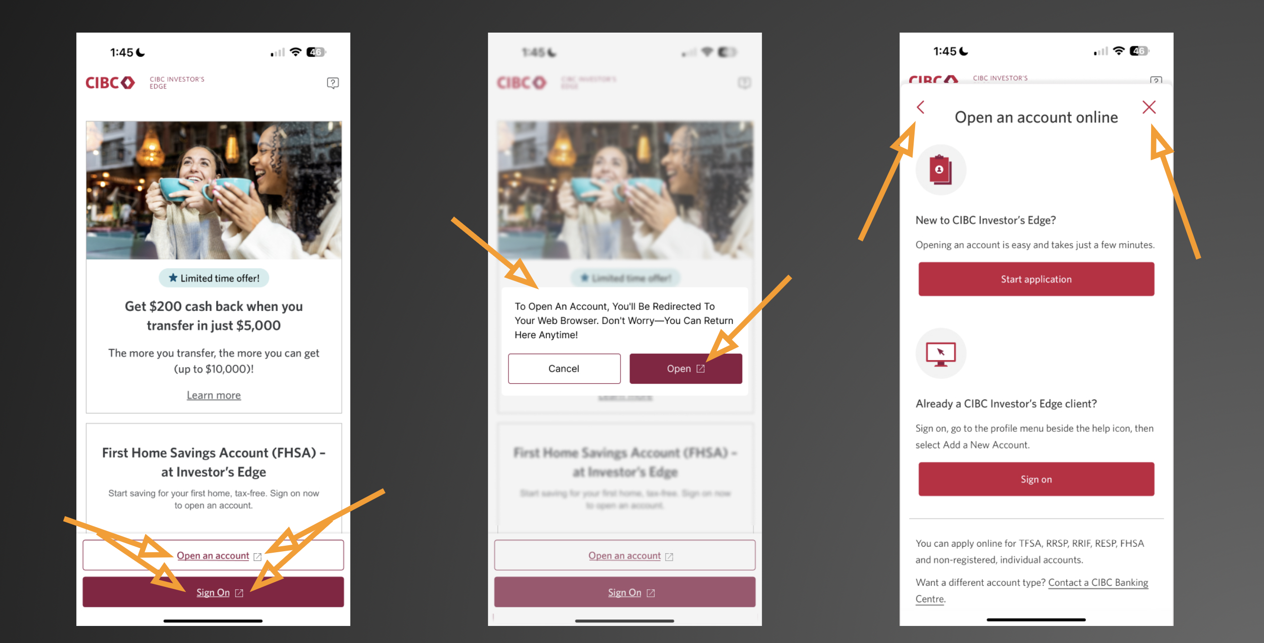
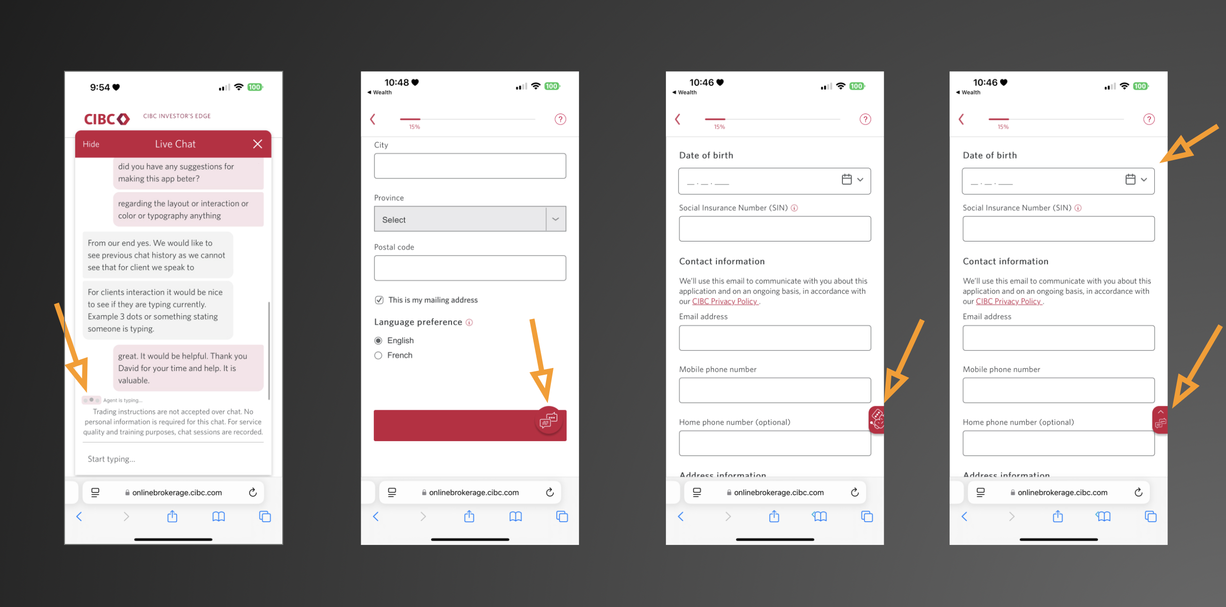
Users were getting lost during the trading process, making preventable mistakes. Key pain points included unclear CTAs, inconsistent states, and lack of trust in confirmation steps.
- Confusing terminology and redundant steps caused hesitation.
- Trade confirmation states weren’t visually distinct.
- Accessibility gaps (contrast, focus states) increased errors.
- Inconsistent field patterns and visual hierarchy caused hesitation and errors.
Research & Insights
I conducted stakeholder interviews, heuristic reviews, and usability testing to identify key friction points. Then I redesigned the process into three simple stages — Input, Review, and Confirm — with clear feedback at each step.
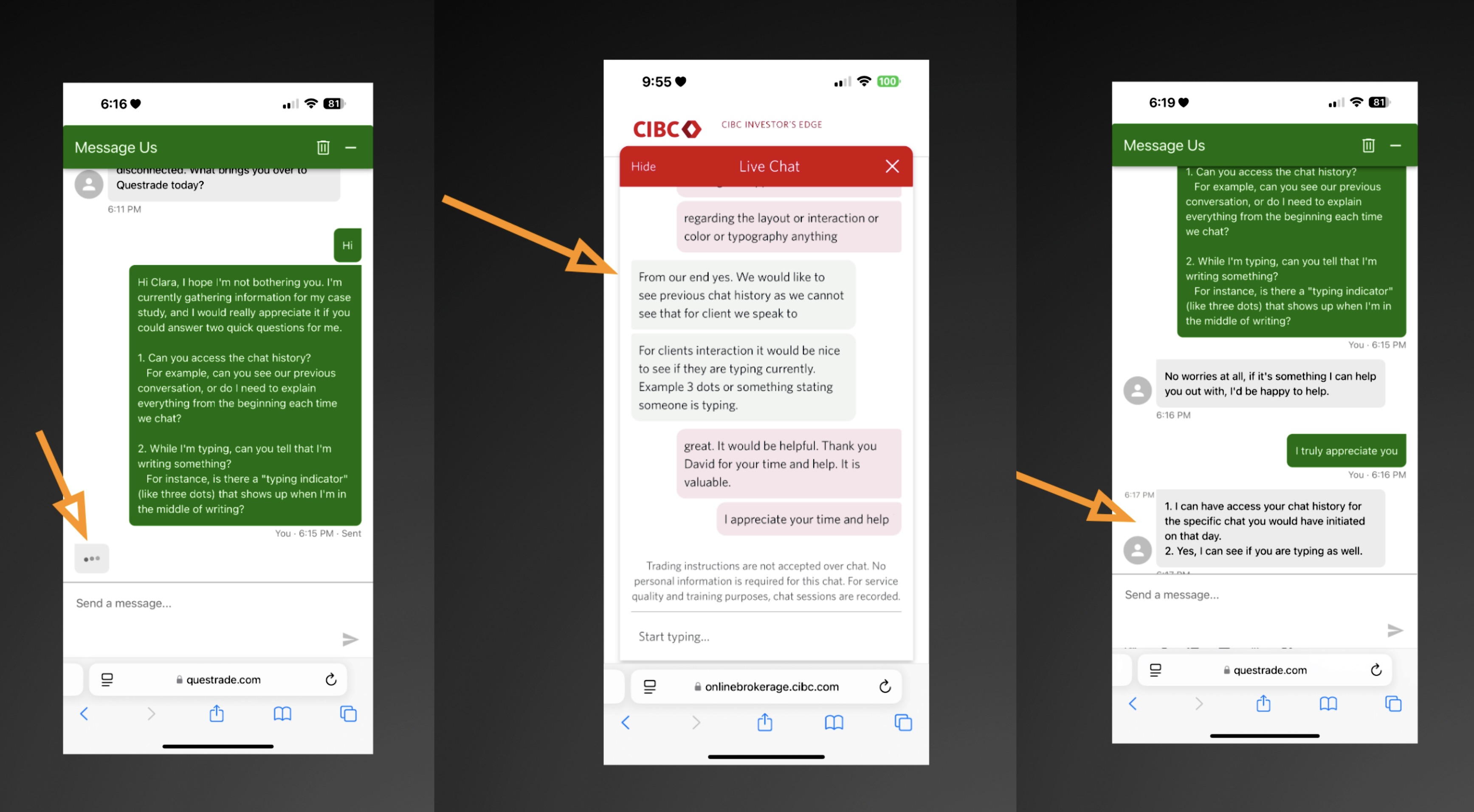
To compare real customer support experiences, I analyzed chat interactions across CIBC and TD to uncover usability and accessibility gaps.
Outcome
Good UX isn’t about adding features, it’s about building clarity and trust — especially in high-stakes tools like trading platforms.
- ✅ 25% faster task completion during trade flow testing.
- ✅ Significant drop in user errors across trade confirmation steps.
- ✅ Improved user trust with clearer visual feedback and accessibility compliance.
- ✅ To enhance perceived responsiveness, I added a subtle typing animation to simulate live chat feedback.
The redesign turned a stressful, complex process into a predictable and user-friendly experience. One tester described it as "more intuitive and less intimidating to trade with."
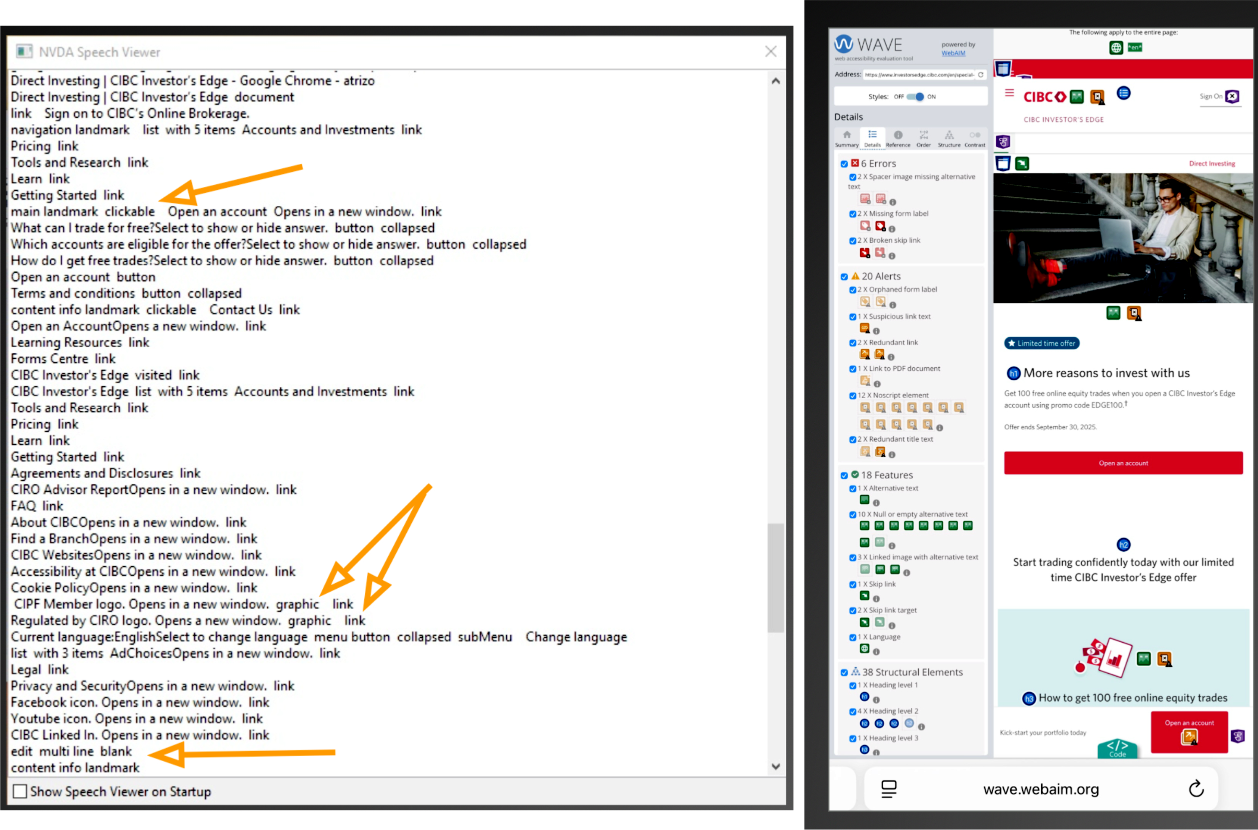
Accessibility Validation
Accessibility wasn’t an afterthought. I validated the final design with WAVE and NVDA, identifying missing labels and improving color contrast for better compliance.